

The Case For Convenience. How These Retailers Built Convenience Directly Into Their Brand Experience


Most innovative design professionals will tell you that color is a key element in retail environments. Colors have a language all their own, with generally agreed upon meanings in a given culture. Yet every store we enter looks a little different, even if they offer similar merchandise. Color is just part of the package defining a retail store, communicating what the store offers and suggesting how to interact. It’s amazing the range of powerful ways to use color on walls and in store fixtures.
Furniture stores are just one example of retail environments that employ different approaches to color. According to a recent article in Furniture Today , the colors we recognize in furniture retail stores often follow one of two approaches – a bold brush or a subtle hand.
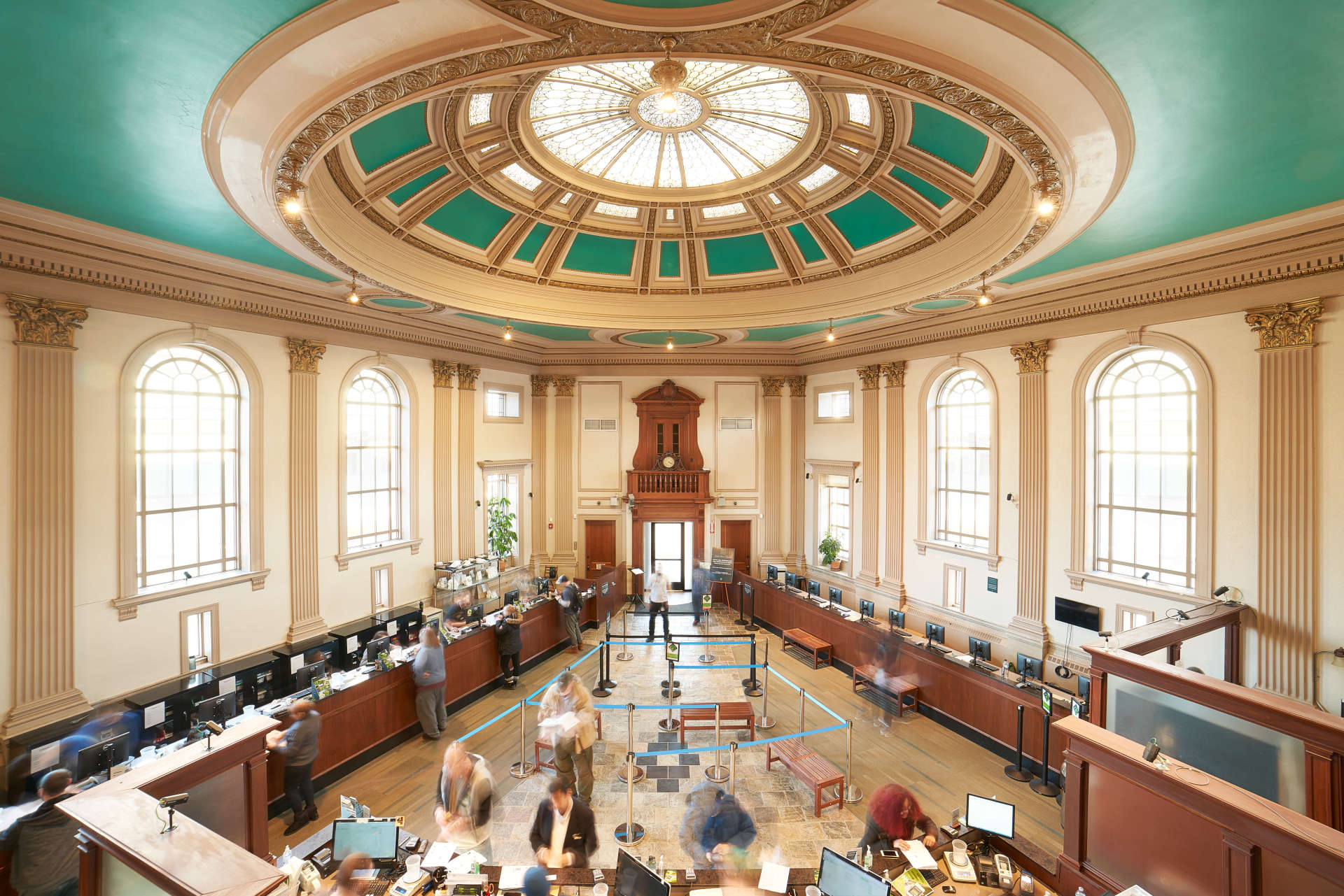
One example of the bold color approach can be seen at Cardi’s Furniture, where colorful walls define the space the moment the customer crosses the threshold. The ceiling features a robin’s egg blue – a color that has been shown to enhance creativity. The color helps define and set the store apart, and is intended as well to help boost customer confidence in their own decorating decisions.
The furniture that sells best most often consists of natural colors, neutrals, whites, and browns. Cardi’s and other stores that favor the bold approach use colorful walls throughout the retail environment to provide a backdrop for the furniture that sells best.
Other furniture stores prefer a different color scheme – softer shades rather than primary colors. They may use mid-tone greys for perimeter walls and darker variations for store fixtures and interior accents. This approach, chartered in 2000 by Restoration Hardware, has become a furniture retail standard that continues in the modern incarnation of RH as well. The subtle colors are employed to avoid detracting attention from the furniture itself, and also to create a more upscale appearance.
Furniture stores also use a combination of muted colors with occasionally bolder hues. These color statements are one method used to pull customers through the store to other areas, or to set apart a shop-in-shop. The new Script home furnishings store in Bangalore is just one example of a store that uses pops of color. The store is designed primarily in neutrals, with grey perimeter walls and floors, and spaces defined using flexible modular store fixtures. Some of these fixtures feature a medium blue – a color that connotes trust and appeals to almost everyone. Various tones of the color are used in fixtures and products throughout the store to create a cohesive design.
In an industry like furniture, with its close link to interior design and increasing general knowledge of design through popular TV and magazines, color plays a particularly important role. These ways of using color in retail environments have evolved beyond the furniture industry to many retail environments.
Of course innovative design involves much more than just a pop of color on the wall. Contact Quarter 20 for retail environment design projects and creative partnerships that go beyond color.
